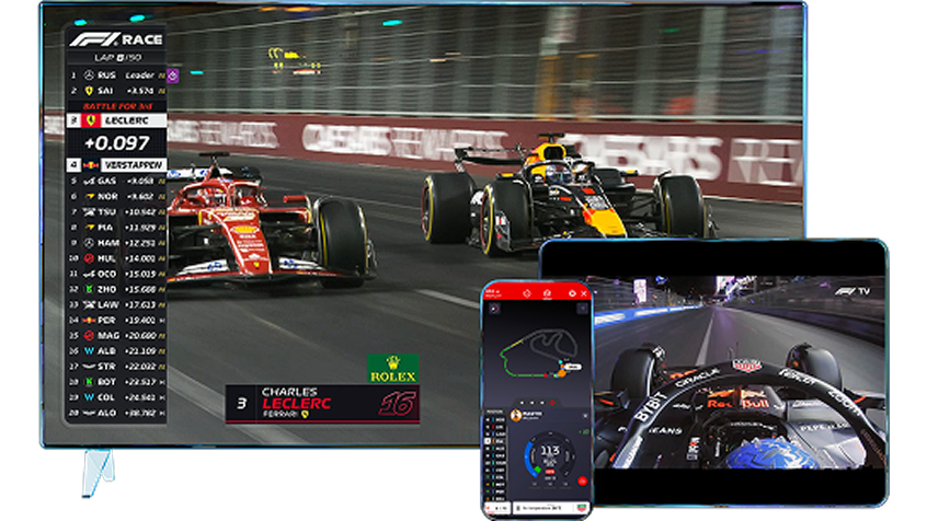
The first race of the season is going to start in 10 mins. My IPTV doesn't have the Star sports HD4 (peo tv in Colombo) and i did what i did back in India. Got a subscription to their f1 for INR 500/year.
Before that i went to f1.com and registered for the access as well.. why did i do it? I'm a UX designer and always enjoyed looking at dashboards and analytics data.
Sorts, Groups and Filters.
I spend almost 2 years working on the above designing enterprise applications for Field sales for CPCG domain, Field Services, CRM on Mobile/Tablet devices. There were months at a stretch i worked just on getting these 3 right. Dashboards are a major component for sales exectuvies, the administrators and the business stakeholders. Everybody needs to see different things. Field agents need to see numbers they need to deliver in a day; the admins need to see how the field agents are with their numbers and the stakeholders need the birds eye view of the business in a region, the country or the world as well.
Dashboards are powerful and there are great inspiration out there.. Check out www.f1.com for some entertainment and inspiration