Newsletters and Ethical Considerations
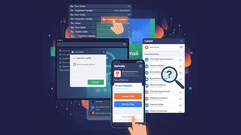
Newsletters, often sent by brands desperate to make a sale, have adopted a new tactic to grab attention. They now include "Re: lorem ipsum" in the subject lines of their emails. Unconsciously, I have clicked on these "Re:" emails, only to realize that I fell for the trick once again and promptly closed them without reading.
But the question arises: Is it ethical to prey on users' behavior and manipulate them into unintended actions?
Dark patterns have long existed on the web, with one common example being the use of default settings that users tend to overlook when trying to complete a task. For instance, how often have you installed a browser plugin without paying attention to the additional software bundled with it?
In the future, I plan to provide more examples from the world of mobile experiences. One noteworthy case is GoDaddy, where buying a domain involves consciously avoiding other offers and finding the hidden "Skip to checkout" option buried within the interface. Surprisingly, the mobile experience offered by GoDaddy is better than the web version.
The Most Annoying Mobile Pattern
I'm curious to know: What is the most annoying pattern you have encountered on mobile?
Here are some examples from the world of Twitter using the hashtag #darkpatterns:
Immediate full-page modal which can't be cancelled except by accepting or declining an offer. Link - Michael Yockey
Can you spot the close button?
Spot the "close" button... Link - Mike Mai
Google has recently changed the ad positioning in Gmail, making the ads resemble regular emails in your inbox. But should advertisers gain value from this? Shouldn't users consciously decide to click on an ad? At least there's a subtle color tag to differentiate them.
How many ads are clicked worldwide because users mistake them for emails? I would bet it's a significant number.
Thanks to Google, we now have a suite of productivity solutions that keep at least one tab in our browsers dedicated to Google products. Even die-hard Microsoft fans would agree: Google Docs rocks!
But is this good design, or does it reveal the sinister side of UX practitioners?
Read more about dark patterns in this article from 2011 to understand how it all started.
Twitter:


