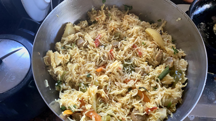
I have been living in Hyderabad since August 2013 and have been exposed to different kinds of biryanis. But when it comes to consistency and meeting expectations, nothing is as good as 'Paradise Biryani'.
A colleague of mine ordered biryani today in the office café while I was enjoying the leftovers of yesterday's biryani for lunch. He received a stale biryani and had to return it. I started wondering why it is hard for the others to copy what Paradise does. After all, anyone can buy the affordable biryani and do a bit of digging to understand what makes Paradise Biryani stand out.
I realized this is also true in the world of mobile apps. Great functionality often remains hidden behind poor layouts and interactions, leading to low adoption.
As far as apps are concerned, the points below can help you make the most out of the good UX out there.
1. Understand the context
When you see a great layout and want to borrow the pattern for your designs, understand that it is not always possible—especially when designing enterprise solutions where functionality takes precedence over experience.
Install the app and experiment with it. Understand the context in which it works; know the before and after views. This exercise helps tailor specific layouts to suit your needs.
2. Invest time in building your own pattern library
There are many great mobile patterns on the web that can serve as useful references. It is always worthwhile to put together a personal collection of favorites and keep building on it. Over time, you will have your own pattern library to refer to. Annotate the screens, write notes. Pinterest can help, but a slide deck or OneNote gives you far more room to document your thoughts. Annotations are powerful.
3. Animations and transitions — subtle but powerful
Simple animations and transitions can enhance the user experience significantly. They offer subtle cues that support the task at hand.
Example: do you remember the animation for the 'Compose' view in your email apps?
Most email clients use the 'cover up' animation and on completion use 'reveal down'. This can be borrowed in many enterprise apps where creation flows follow a similar pattern.
Understand that mobile design is more than just a great layout.
On a different note, enterprise solutions can incrementally add complexity to their product line. This may not always be possible, but apply it where you can.
Never let
Secondary features hamper primary functionality.
Have I missed any points? Let me know.
We are surrounded by great biryani in Hyderabad.